TRAVEL PORTFOLIO
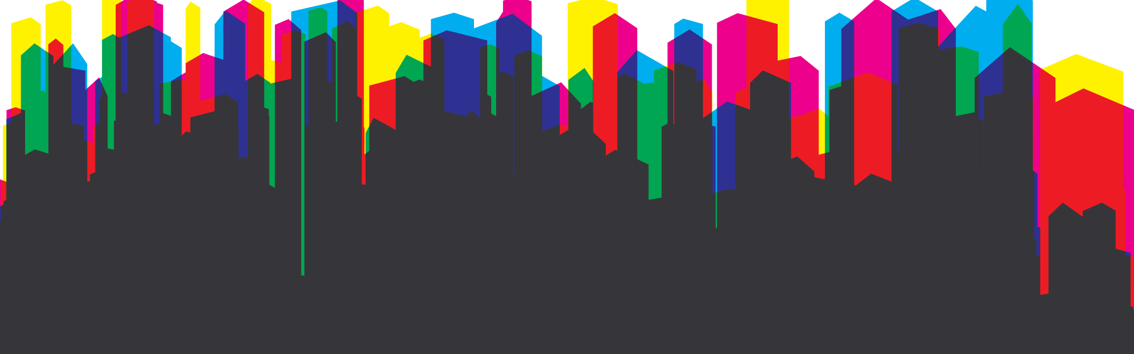
For this class I really tried to focus on the massive amount of skyscrapers that are all around Hong Kong. I tried to change them into very basic shapes and compose a stacking picture to display how I really feel the buildings appear in the city. After I had completed the first piece I realized I could also incorporate the large amount of color that appears from the signs and clothing in the city. When I got this idea of stacking structures it was really what I focused on for this class. I think that the changes I have made with color can express the different ways that Hong Kong can be seen in general.
You can also see the development of shapes from just lines to actual buildings that I ended up with in the end. The process I went through consisted of creating the main piece using basic lines of structures and then coloring them. Usually I would start out by adding a rainbow of colors, covering the 6 basic colors, as to represent the amazing amount of colors here in Hong Kong. After this step was done I would begin changing the colors again to different color schemes to see how they matched up. In the end the Cyan, Yellow, and Magenta scheme fit this work the best. Then after that I would begin blending each layer of color to see what kind of changes it would make and how I could move the structures around to see what it would look like. I also went through multiple compositions as the quarter went on to test what kind of ways I could represent the city.
I really enjoyed doing this project because it gave me a chance to create some art that I would definitely not create on my own. When I draw in my free time I usually create very gestural cartoons of people or animals so creating this environment of only buildings was very different for me. There were some things I was unsure of while creating these but I think in the end they all worked themselves out. I do, however, wish I had stuck with a bit of a different composition for my last drawing but it came out alright. I think that if I were to keep creating these and develop it further I would try and transition them in to some sort of poster design for Hong Kong. I have enough reference pictures to last long enough to make these for years to come!
Hong Kong
Hong Kong is a preverbal forest of buildings and colors, especially at night. I stuck with a color scheme that I played with from the original drawing, just using cyan, yellow, and magenta and I think it works really well to help the city pop out more in terms of color. There is also some influence from when I visited Macau while I was there in these pictures, (this one and the one below this)


I made many versions of this piece after I completed it, mostly just playing with the colors in the work. Click to scroll through my other versions of this project that I created.
This is the original image I created as an kind of symbol for how I think Hong Kong feels like. It is very overcrowded and, of course, full of sky scrapers. I added in the addition of the rainbow colors to represent how colorful Hong Kong can be in terms of signs and people.
Hong Kong - Others


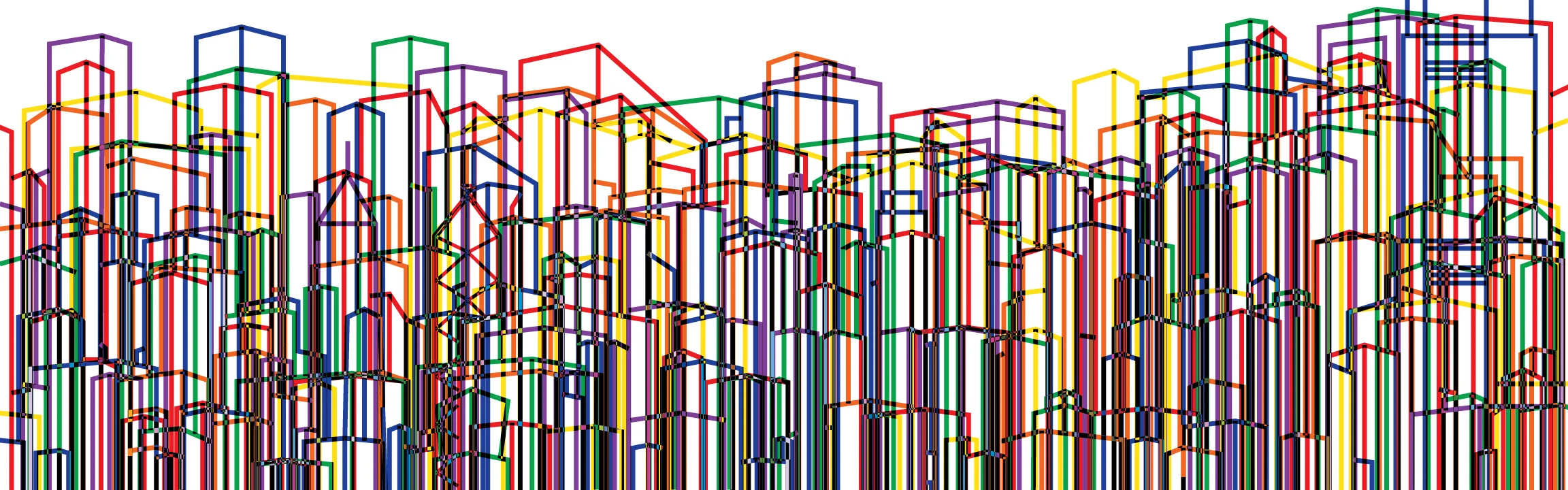


Click to scroll through my other versions of this project that I created.
This was another experiment I had done for the travel portfolio project I was working on. I tried to incorporate depth and the mist that is everything in Hong Kong. I used a reference picture for most of this which is a bit unique to the others I have done which were mostly multiple photos and from my head. I wanted to incorporate the water that is also very prevalent in the design of Hong Kong.


Travel Portfolio Sketchbook


I didn't make as many variations of this piece but I still did some work with color and composition. I guess I didn't really end up liking this idea as much as my others but in the end it came out alright as a different piece.
Mop/Sponge and Ink Paintings


These three images were painted with either a mop or sponge and Chinese ink. They also interpret my focus of the buildings in Hong Kong.
Other Art Work
Drawing I did using just the primary colors. I made this during my first year of college and I still really like it. The assignment was to use some kind of food in your design and I went with a kind of comical direction, which is usually what I enjoy doing.
I piece I created that needed to include different parts of the face sectioned off. I enjoy using charcoal and working in black and white. I think this is one of my favorite pieces I have ever made.


Some miscellaneous works that I have created in the past that I still enjoy to look at and I hope you do too!